[Post by Chuck Krugh, February 24, 2023]
In the last blog, I talked about the use of balanced scorecards and how they are developed from our strategy. Balanced scorecards help us gain a high-level understanding of how we measure our company’s progress toward our goals in terms of a numeric value. And – like the name says – it’s a good scorecard to tell us how well we achieved our goals by the end of the year.
However, we need to take ongoing measurements so we can make adjustments where needed as we work toward our goals. To do this, we will use two types of dashboards. The first and simplest dashboard is the viz-board, which I will cover here. It also is the one that will be most visible for all the people on our team!
As you look at the viz-boards that we have begun deploying, at the top you will see five letters. The large letters correspond to our key areas of performance: S for Safety, Q for Quality, S for Schedule, C for Cost and P for People. Safety and People surround our other benchmarks because we value the safety of our people as a priority in Safely Executing High-Quality Work each day. Each letter is enclosed in a large circle with smaller circles that represent the days of a month.
The smaller circles in each category are used to indicate daily performance – except for Cost, which is updated weekly instead of daily. The circles are colored each day according to a Red-Yellow-Green color scheme so the team represented on that board can easily understand where the team is in relation to each of its overall goals in these five categories.
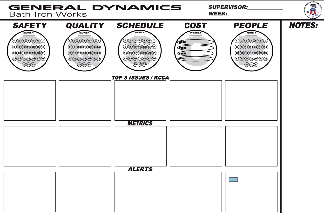
- Red = Not meeting the goal.
- Yellow = The goal is at risk or we have identified some areas that need attention.
- Green = Meeting the goal.
Each metric has its own rules for applying the colors based on what the team’s responsibilities are within the company and the current performance of the team.
The visual status of each indicator – for example, Safety – forms a dashboard we can use to benchmark our performance in that area. This is your team’s performance! This viz-board makes it easy to see how your team connects from your point of execution to the larger company goals.
Now let’s move up a level. The next viz-board up, the manager’s board, will follow the same process described above, except it will be a higher-level board. A key difference between the manager board and the point-of-execution board is that the manager board is a roll-up of all the point-of-execution boards under his/her responsibility. In other words, we combine the data from each board and make one metric in each category for the manager board. Think of it like adding each of the board scores together to make one score for each category.
As you might have already figured out, the viz-boards will cascade up through the levels within the organization using this same process until the data they represent reaches the company-wide viz-board. The number of boards will shrink as each levels represents larger parts of each department. Each department’s board will then roll up to the company-level board. It’s like a pyramid – a lot of boards at the points of execution, but they consolidate as they cascade up into one company board.
I hope you get the idea and the usefulness of the viz-board as a dashboard for everyone to quickly understand how we are doing in a given area of responsibility.
You might think that’s enough, but in many cases we have several other supporting metrics to measure a particular strategy or process. In that case, we use a more detailed dashboard that we will cover in the next blog.
See you on the deck plates!
Safely Execute High-Quality Work
Chuck
President, General Dynamics Bath Iron Works
Click here to view more From the Helm blog posts.